After almost 5 years on the market, we have undergone a lift!
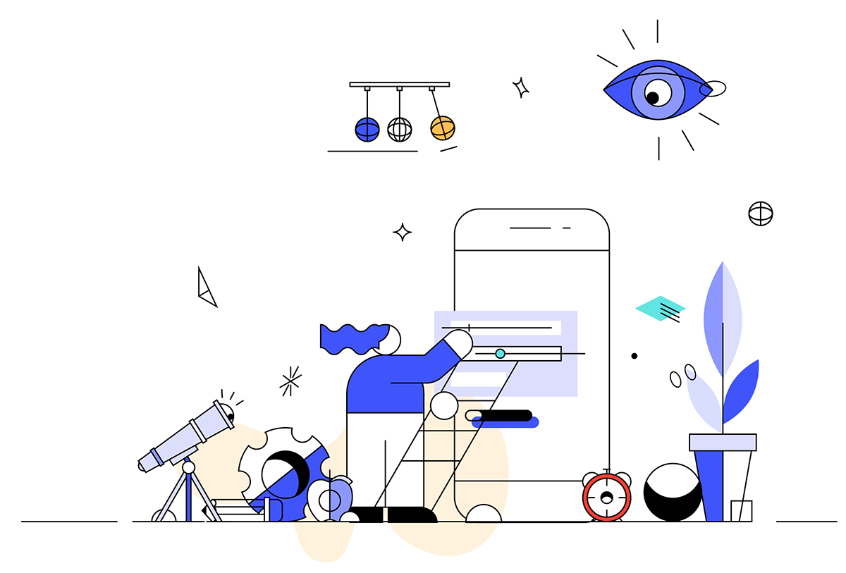
The refreshment of the visual identity is a response to the dynamic development of the company and the changing digital space. Thanks to the extensive color scheme, phenomenal illustrations will become part of the brand’s visual language, which will support text communication.
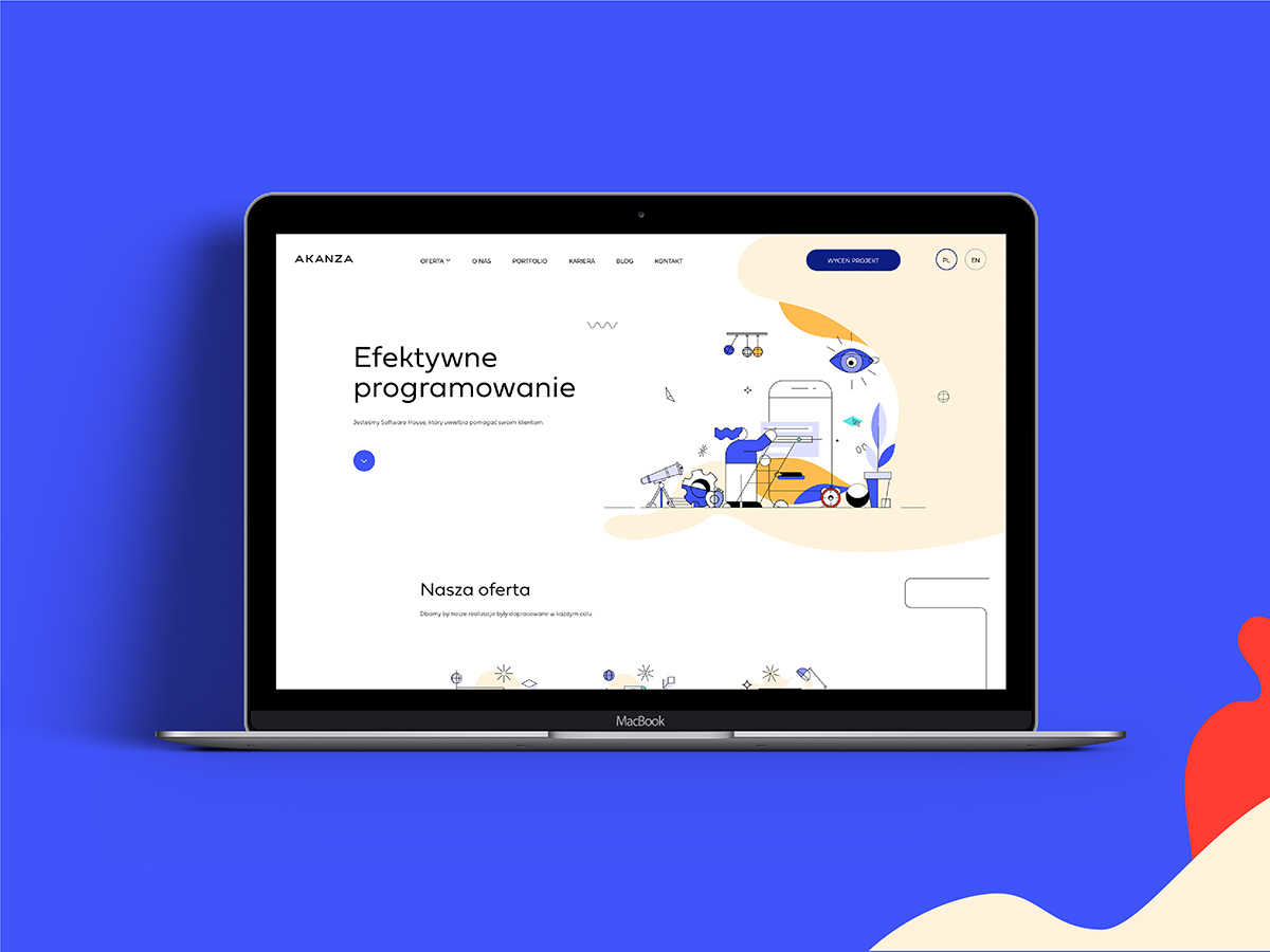
Animated illustrations become part of the visual language of the brand. Our logo is now clearly simplified – the existing signet has been removed and the typography is more legible. Fieldwork has become the basic typeface, which works well in digital and print formats.
The new identification is to be primarily user-friendly and effective in business operations. It is a powerful tool that gives us new possibilities of communication around the world.
Our long-standing partner “Motyw Studio” is responsible for impressive graphic works. The animations are a lively website, and they are the work of “Trzask Studio“.


